Blockchain Dashboard Data Visualization
This is a redesign of a dashboard data visualization for a blockchain startup.

Overview & Final Design
Problems
The dashboard displays blockchain protocols that received grants, along with relevant information presented in various tables and graphs. The page was cluttered, with separate scrollable sections that further reduced usability.
Solutions
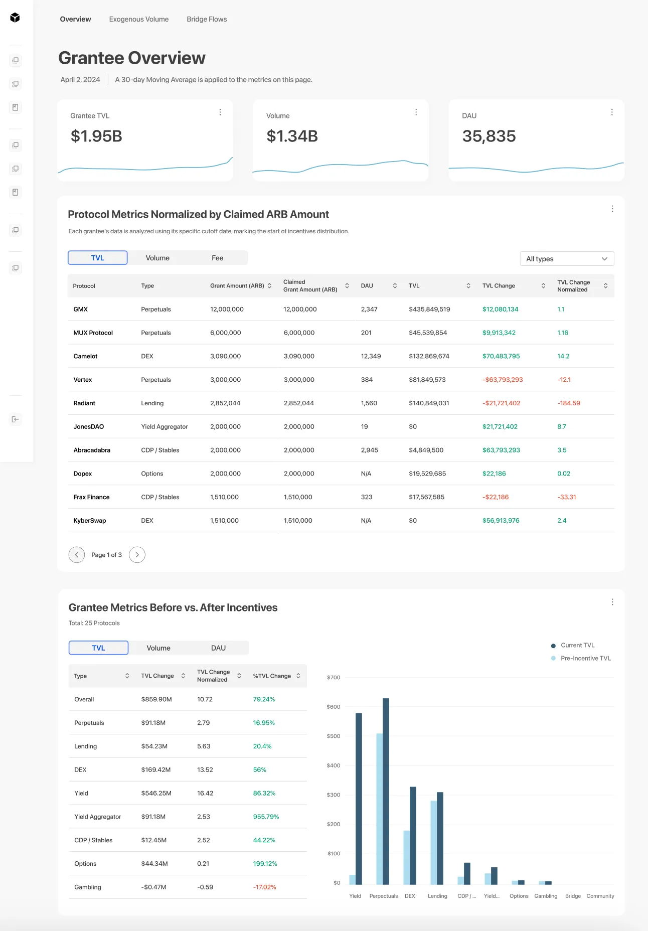
With limited time, my goal was to reorganize the data and present it in a way that simplifies the information.
BEFORE
AFTER
See design annotations in the following sections
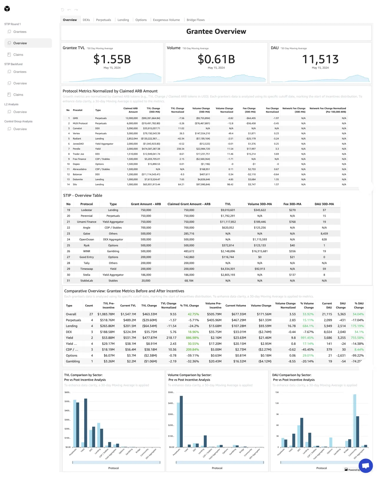
Too much info, some of it repetitive, competing for space and making it difficult to read.

Users caught in a confusing design, attempting to make a payment repeatedly without success.
BEFORE
AFTER
Use tabs to reduce columns for better scannability and lower cognitive load
Merge two tables into one and allow users to sort by data type

Clearly present the two available options. Relevant prompts shown only to users to whom the message applies.
The relationship between the table and graph was unclear, and the graph itself lacked clarity

Another dense section with a bolded header containing info only applies to certain users, not everyone.
BEFORE
AFTER
Combine table and graph to display one data set at a time

Clearly present the two available options. Relevant prompts shown only to users to whom the message applies.
Detailed information displayed on hover
Added a legend to improve clarity